Our New Web Site
August 2016
After eight years with only running changes, by 2016 the Midwest 356 Club web site
was looking a bit dated and running on a less than up-to-date chassis. So we have
reworked it from the ground up to have a more contemporary look, better road manners
and a modern technical architecture. It's kind of like what Porsche did in 1965,
except that in this case what has been replaced will not be remembered as a classic.
Here is a closer look at what has changed.
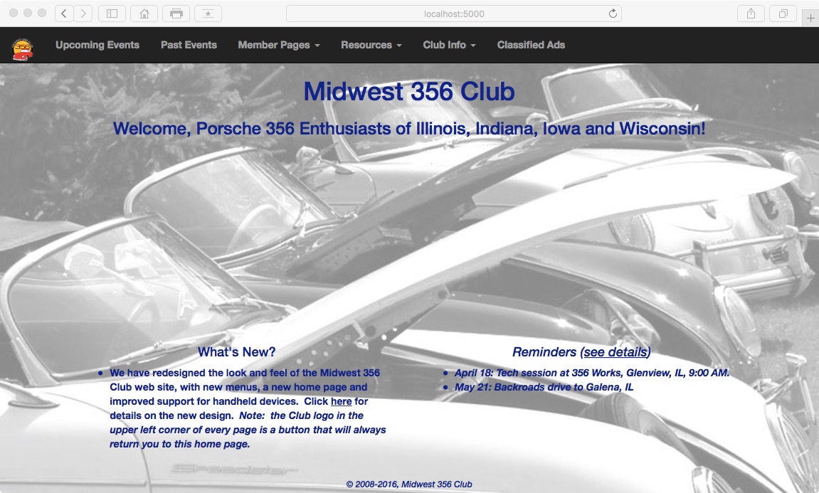
The first thing you will have noticed is that the picture on the home page has expanded to fill
the entire window. As before, the image you see on the home page will be selected
from a collection we maintain, and the selection will change each time you
refresh or revisit the page. Because the text is now superimposed on the image,
only images that allow the text to be legible will be used from now on.
(All the old images are still available to view, stored as a
past event in 2015.)
The navigation menu for the site, which used to be on the left side of the page,
now occupies a bar of black buttons across the top When viewed on a computer
screen, there are seven buttons: one showing the club logo and six containing
text.
You may recall that the old site menu contained many items, 18 to be exact. The
new one gets by with seven by using submenus. Notice that the menu buttons for
Member Pages, Resources, and Club Info all have a little arrow after their text. That means
they contain submenus that will appear when they are selected:


This arrangement allows the items you are likely to use most frequently to appear in the main
menu bar, keeping it uncluttered while making all the other items easily accessible in
submenus. An additional benefit is that the menu does not disappear when you scroll
down the page!
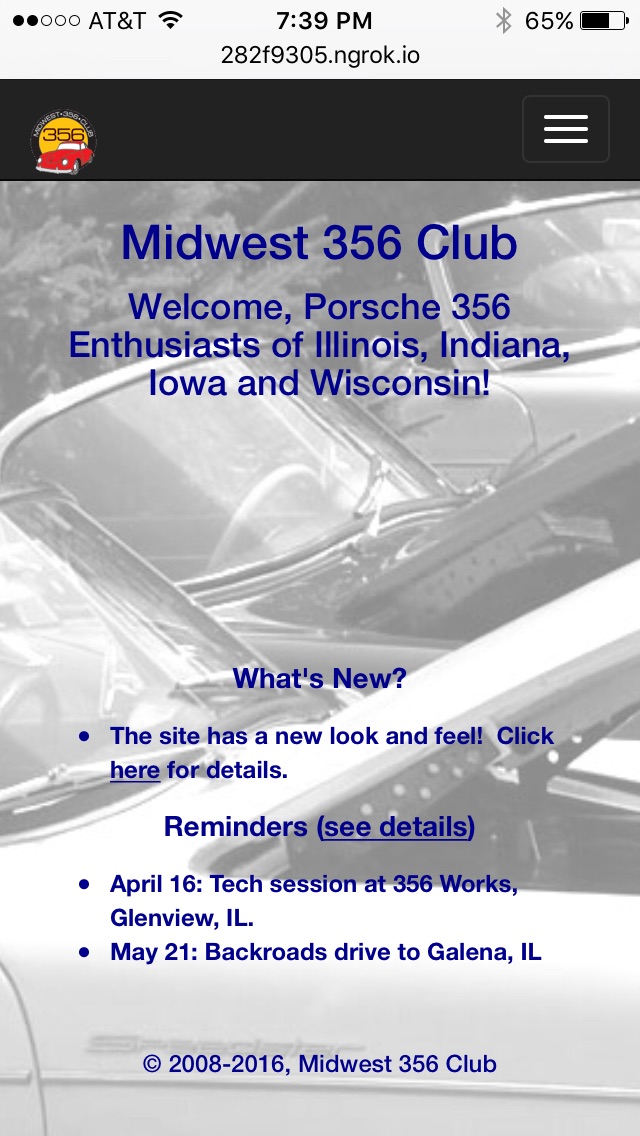
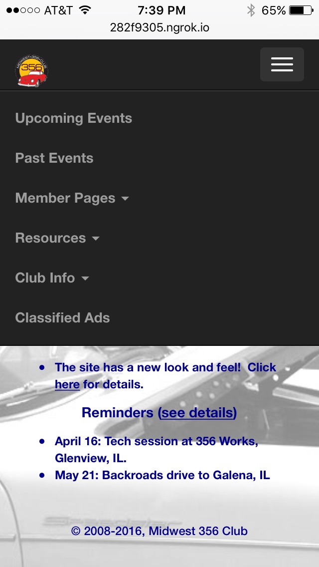
On smaller devices such as phones, the text buttons are replaced by a
single button on the right showing three white bars, which when tapped causes the text buttons to
appear below it in a vertical array:
For any tech nerds out there who may be interested, this behavior is all handled seamlessly behind the scenes by a software library called Bootstrap, which allows each page to adapt its presentation to the size of the screen being used.
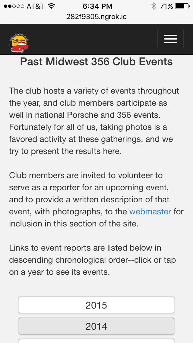
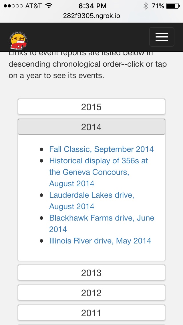
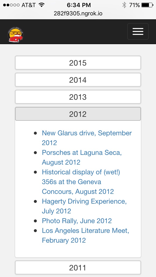
The content of the non-home pages is unchanged from the old site, with a few formatting changes, most of which are inconspicuous. The only page that has changed at all radically is the one listing past club events. At present, that list has reached 45 items over the span of 12 years. That's too long a list to comb through to find an event, so we have now grouped them by year into what's called an "accordion list" where you can select the year whose events you want to see:
That about covers the redesign of the site. As always, if you have problems using the site, or if you are a member of our Club and would like to contribute content to the site, please email webmaster@midwest356.org.)